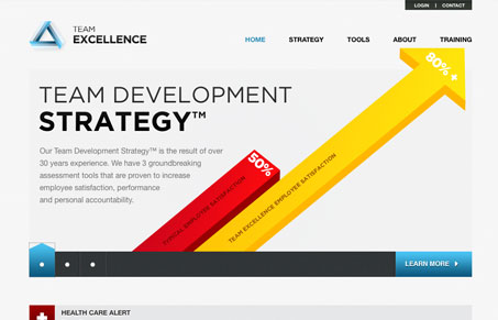
I like the big bold info-graphics used on the home page of the Team Excellence website. There’s a ton of information on this site, graphs and charts and psychological explanations and the design makes it all seem like it’s accessible to anyone. A good design can do that.
Looking Fast: The Art of Website Speed Perception
In the web world, technical speed and user perception matter. By improving design for a faster appearance, you boost conversions and stand out online. Speed isn’t just loading time; it’s perception.


Nice use of bar graphs, poor logo implementation.. too light, requiring drop shadow.
The rest is fairly standard fair… light grey, blue-teal, slideshow, serif fonts. Overall nice though.