
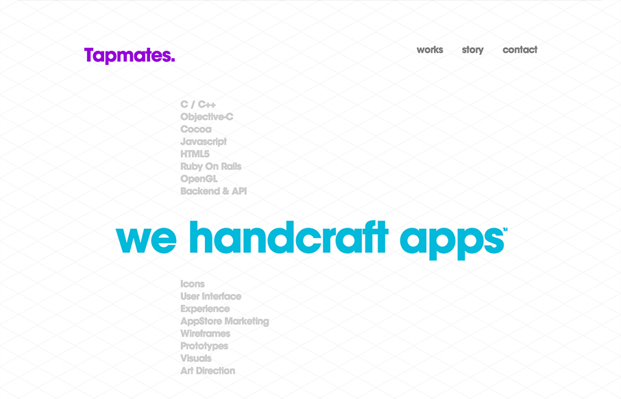
Wow, what a beautifully designed layout. It immediately makes me think of the swiss school of design. I love the diagonally aligned screenshots and then the timeline is a really smart inclusion. I also love how it get’s more involved visually and interaction wise as you scroll down the page.


Fitts’s Law: Why the Easy Button Wins
Large, close targets are faster to hit than small, distant ones, that’s Fitts’s Law. A look at the 1954 rule behind buttons, prime and magic pixels, thumb zones, and dark patterns.


0 Comments