
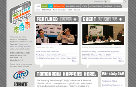
The new SXSW website is extremely vast in it’s content, it’s probably the largest conference website i’ve ever spent time on. That said I think it’s organized really well. It’s also a rather clean design which is always good when you have so much content. The branding is smart how they have the different colors and robot heads to communicate the different tract types. I think they’ve suffered some legibility by using that typeface and it’s clearly not an easy one to use as the “tomorrow happens here” header is on just about every single sub page.


Fitts’s Law: Why the Easy Button Wins
Large, close targets are faster to hit than small, distant ones, that’s Fitts’s Law. A look at the 1954 rule behind buttons, prime and magic pixels, thumb zones, and dark patterns.


0 Comments