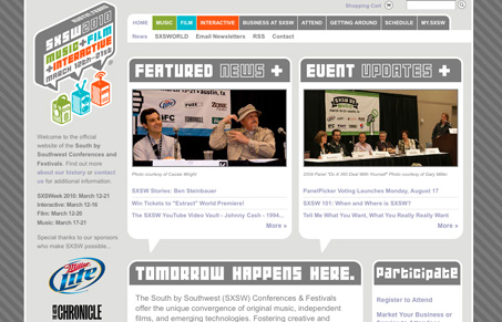
The new SXSW website is extremely vast in it’s content, it’s probably the largest conference website i’ve ever spent time on. That said I think it’s organized really well. It’s also a rather clean design which is always good when you have so much content. The branding is smart how they have the different colors and robot heads to communicate the different tract types. I think they’ve suffered some legibility by using that typeface and it’s clearly not an easy one to use as the “tomorrow happens here” header is on just about every single sub page.
Glassmorphism: The Transparent Design Trend That Refuses to Fade
Glassmorphism brings transparency, depth, and light back into modern UI. Learn how this “frosted glass” design trend enhances hierarchy, focus, and atmosphere, plus how to implement it in CSS responsibly.


0 Comments