
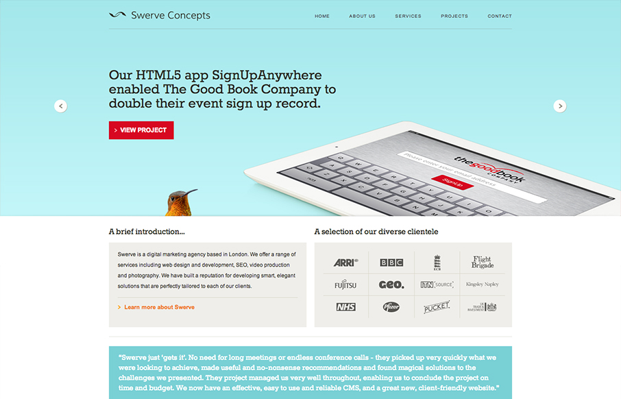
I like the clear blocky grid for this design. Right angles and squared off images, then the big oversized slideshow at the top. Pretty common layout formula but it’s pretty groovy here to me. Pretty funny use of the animal heads throughout the site. Humor is funny.


Fitts’s Law: Why the Easy Button Wins
Large, close targets are faster to hit than small, distant ones, that’s Fitts’s Law. A look at the 1954 rule behind buttons, prime and magic pixels, thumb zones, and dark patterns.


I LOVE this site. Your team did an incredible work putting this together.