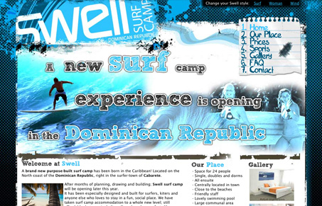
An interesting site, nice “grungy” type feel that fits the surfing brand well enough. I like the background and the logo treatment the most. I’m not sure I love the heavy images in the header area. You can switch out your “style” as well and each is as good as the one I’ve sampled here.
How do you guys feel about them giving you the ability to switch out the design?


I think it’s great, but then again I made the site.
Thanks for taking it up on Unmatched Style.
Feedback is very welcome, since I am no expert designer
The “Surf” theme is my least favourite. The background is too dark-coloured for the subject matter and the footer is bare. The masthead is eye-catching though.
I like the “Wind” theme the best overall, especially the colours, but its navigation layout is too disjointed. The numbering makes it even less usable because the visitor will likely try to read the links in numerical order.
The “Woman” theme suits the content the most because its bright colours (light blue, orange, yellow) quickly convey that the site is about surfing. This theme also has the best navigation layout.
The body copy could be more readable. Increasing the line-spacing and the sizes of headings would make the content easier to scan. The FAQ page could use a summary of questions at the top and the text area is a bit too wide (as a general rule, you shouldn’t have to move your eyeballs horizontally to read it).
The themes look expertly designed, aesthetics-wise. There are just some minor useability issues.
Thanks for the feedback Tim.
I will be looking at the issues you raised, and work on them to improve it.
Thanks and have good day
Looks good. I like the simplicity of the style with the waves, notepad, and images.