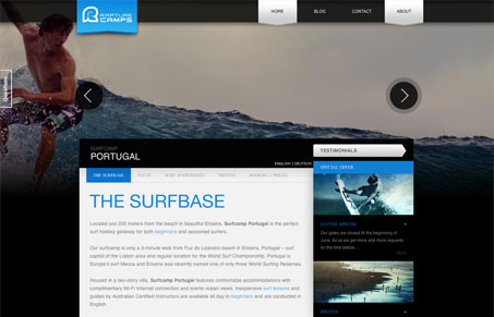
Deceptively simple layout. I think it looks overly complex because of the large slideshow/background image. Outside of that the layout is really straightforward. Sometimes I like site’s like this that project themselves to be larger than they are in terms of content. I’m not sure that was the goal of this site design but it’d defiantly a result for me.


0 Comments