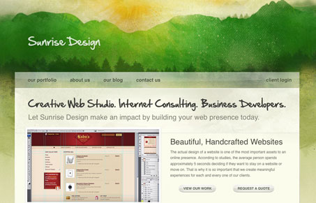
I really like the texture used in this design, the watercolor feel is really well done. The site leads down to a leather-like texture in the footer and the two column layout above that is rather effective. I think the header is way to big to and makes the different state tabs for the main section push below the fold, that’s likely going to be hidden to most visitors.
Glassmorphism: The Transparent Design Trend That Refuses to Fade
Glassmorphism brings transparency, depth, and light back into modern UI. Learn how this “frosted glass” design trend enhances hierarchy, focus, and atmosphere, plus how to implement it in CSS responsibly.


The watercolor header just seems to rip-off Viget Design blog (http://www.viget.com/inspire/) a bit too much and the state tabs for the main section are a bit too similar to expression engine’s site (http://expressionengine.com/)…
The tab interface is very similar to that on the Expression Engine site (http://www.expressionengine.com)