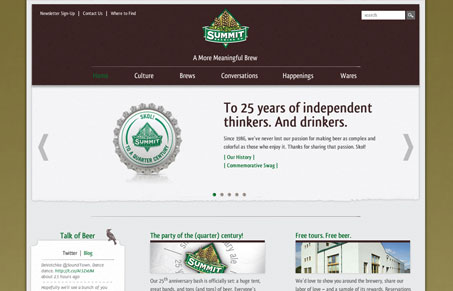
What I like most about this site are the interactions. The oversized dropdown navigation elements are pretty well done. I actually like the slight transparency used on them. I also love the way the beer examples are interacted with in the bottom of the home page. Seeing the bottle grow in size then they have the bottle cap in the tool tip pop up thing. Nice touch on those.


This site leaves me a little flat (no pun intended). It’s nice in that there’s nothing wrong with it. It’s just that whenever I see a site about something as rich as beer, something that people get so passionate about, I want that to come across in the design. The beer bottles at the bottom are a start in that direction, and probably should be a more prominent part of the home page than all the way at the bottom.
Yeah, it does skirt the line between “corporate” and “beer” too closely.