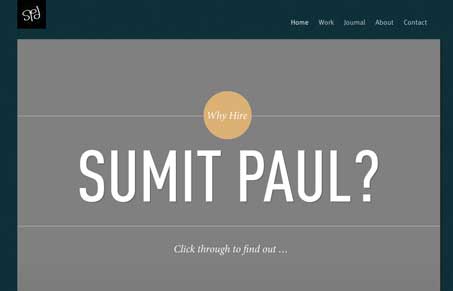
I like the stark graphic feel to this design, the strong lines and strong colors set a nice tone. I also really dig how the slideshow is used like a presentation. That’s kind of a smart way to present your info like this. The website is generally really clean and almost minimal in the way it’s put together. Very sharp site design!


Am I the only one that thinks the top grey area looks like the whole block was highlighted in the browser? Hope that makes sense.
Anyways… It did impress me with it’s uber simplicity and interesting color scheme.
Wow! thanks for featuring my website on UnmatchedStyle!