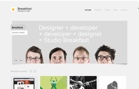
I like the minimal direction in this site design, the simple type treatment and just relying on well cropped portfolio examples puts the right stuff forward when you look at the site for the first time. I like the fixed header, it’s subtle gives some sophistication to the simplistic layout without being over the top. The portfolio page has a neat loading effect too.


0 Comments