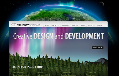
I really like the nice clear and clean graphics on this site, nice grid and nice typography too. This site has many of the web 2.0 type style design elements but there’s just something about it that’s particularly striking to me.
Glassmorphism: The Transparent Design Trend That Refuses to Fade
Glassmorphism brings transparency, depth, and light back into modern UI. Learn how this “frosted glass” design trend enhances hierarchy, focus, and atmosphere, plus how to implement it in CSS responsibly.


I agree, and what I also like about this site it that the designer is not afraid to make the user scroll. So many clients are concerned with getting all the major content above the fold, when I think that scrolling is integral to browsing the web, on the front page or any other. Great images too 🙂
I have to disagree a bit, while there are many well designed areas of this site, it’s one thing to be ok with scrolling and another thing to force the user to scroll to find out anything about what they offer. I think if they lost or minimized that background earth image, tightened up the space under the navigation and moved everything up it would be much more successful. Once you get into the subpages, after scrolling down, it’s actually quite nice as it is.
Also, all the links under ‘Our Service and Ethos’ are very good. They’re easy to understand and I have an idea what’s going to be behind those links, but they’re kinda way down the page. The ‘Explore’ button, on the other hand, is totally useless. I have no idea what page I’m going to go to by clicking on ‘Explore’. It turns out it goes to the portfolio page. Why not make ‘Portfolio’ the link? Just because ‘Explore’ might sound better than ‘Portfolio’ doesn’t mean it will work better.
The portfolio section is one of the best parts of this website. I really like how they include multiple parts of the project in one shot. I also don’t really have any issue with the scrolling – while I’d like to see more actual content above the fold, in this instance I don’t know that it’s a particular detriment to the success of the design.
I think that what’s “particularly striking” is the background and masthead. The colors, the sensation of depth, it’s an amazing background.
The background and homepage masthead are stunning. I agree that the images hog all the space above the fold, but the designers can get away with it because in part, awesome visuals are what they’re selling.
The site is easy to read although I think that the “View..” buttons on the Portfolio page could be more conscpicuous; the grey colour doesn’t stand out.