
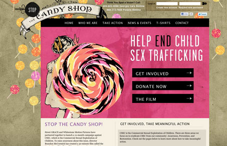
Cool looking site, I love the color choices here. The colors really stand out to me as being something you don’t see all the time. Nice illustrative work here too, the candy imagery and the floury looking pieces really help to add to that unique vibe of the site. It’s a great cause too!




You can watch the movie that this site is promoting over on http://www.thedoorpost.com/ and if you like what they’re doing, maybe even vote.