Submitted by George Oommen @stonelab, the site’s Designer & Developer.
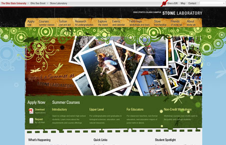
The website follows the print identity and tries to tie everything together with various graphics elements. The site focus on the most relevant content to the students. There is also a lot of flash based media littered through the website. The site is uniquely heavy on graphic elements.
This is a really great website, there’s tons of details and graphic elements. It’s very well done, each subpage has been given care and thought. I really like the way the PDF’s are handled on the apply now page and there’s a nice flash map of the island on the site too. There’s plenty of great ideas on this site to use for your own clients if you’re looking for some inspiration now and then. Check it out for sure.


Really nice site. Love how the content on the home page breaks into two sections—above the fold and below the fold (to use traditional print terms)—in order to provide a lot of content and still create a sense of hierarchy and breathing room.
Menus are done really well on the home page and interior pages, and I like the kind of index at the bottom, too.
The website looks super cool! Its totally different from the ‘usual’ OSU webpages.. 🙂 The mouse-pointer sensitive menu buttons are nice. Overall, it has a good aesthetic appeal to it.
Great job!!
Wow, this is a rich site. The design elements both look great and make logical sense as functioning objects. Good interface design- great experience for the user.
Great website! The Ajax and Flash stuff make the site real cool… great design!
Great graphics, and excellent CSS