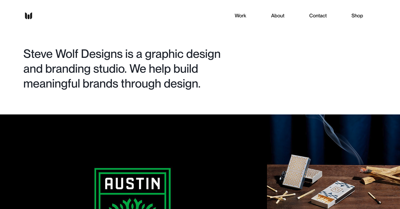
Love the grid here. The juxtaposition of the type and images is solid. I like the little “flitter” of the photo before it loads into it’s place on the grid, it’s subtle, not subtle, and always makes you take note of the element.
Why Some Clients Think They Know Design (And How to Keep the Project on Track)
Ever wonder why some clients over-explain or dodge your questions? Learn how to navigate unclear client communication and keep your design projects on track with practical, experience-based strategies.


0 Comments