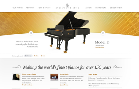
This site design is full of very delicate ornamental pieces but yet maintains a minimal quality that I just love. Keeping the individual piano pictures in the center of the page is also a smart design decision, since it makes your eye zone right in on them then scan out around the center to take in the tag line then the main navigation. Overall a beautifully done website and using Typekit to boot!
Glassmorphism: The Transparent Design Trend That Refuses to Fade
Glassmorphism brings transparency, depth, and light back into modern UI. Learn how this “frosted glass” design trend enhances hierarchy, focus, and atmosphere, plus how to implement it in CSS responsibly.


Thanks for the review… much appreciated.
Oh man, didn’t know that was you on this site design. Great work Jesse!
…. and this is how it’s done. I probably look at this site once a week.