Gosh where to start. I simply love this design, it’s so full of great little details it’s overwhelming. My favorite page is the tour page though. Those illustrations are just so simple and engaging.
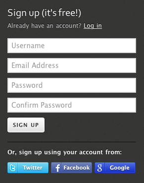
There’s so much great interaction detail to study on this website, like from the way the form fields interact on the sign up form to the featured notes mouse over. I love the highlighted field effect when you click into one and the text description of what you need to enter fades away (I suspect that’s webkit to check this site out in chrome or safari).
The sub page sections are also so greatly designed. From the “places” map interactions to the pagination and action icons/buttons on the discussion page. Really go spend some time on this site, there’s so much here to learn from.

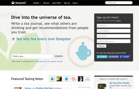


love this as well, the only thing that is throwing me off is the different styling for the search box.
Oh right, one of those sites where they forgot to specify a page background color and it looks really weird with an other-than-white default browser background.