Squarespace Blog

http://blog.squarespace.com/

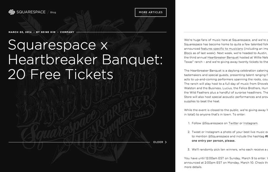
The Squarespace Blog is very simple at first glance. Keeping all the relevant content for the post (or most recent post) front and center. You can slide open a list of past posts, that have nice little hover effects of the images. On the right is the now standard hamburger icon to open up the overall Squarespace global links navigation.

I like the idea of keeping them out of view in general but i’m also torn over it, if it’s important why hide it?

Is it all just for the mobile experience.

If so is it at the cost of the desktop experience, does it really matter?

0 Comments

Submit a Comment

Your email address will not be published. Required fields are marked *

News & Articles

Looking Fast: The Art of Website Speed Perception

Looking Fast: The Art of Website Speed Perception

In the web world, technical speed and user perception matter. By improving design for a faster appearance, you boost conversions and stand out online. Speed isn’t just loading time; it’s perception.

Designing for Errors: Creating User-Friendly Contingency Plans

Designing for Errors: Creating User-Friendly Contingency Plans

Contingency Design hinges on empathy, understanding user frustration, and transforming errors into positive impressions. By embracing these principles, you enhance user experiences, retain customers, and boost revenue in the competitive digital landscap