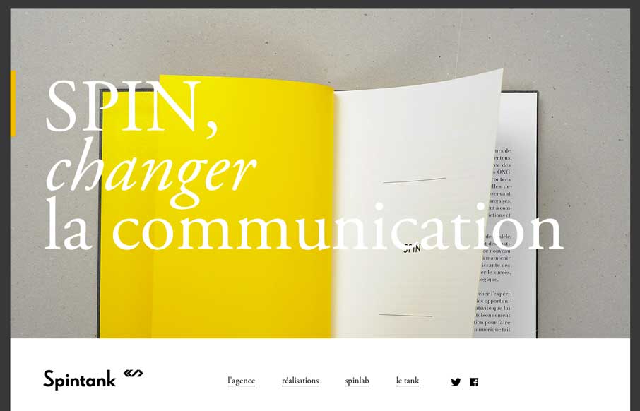
With as many website submissions as we get, I admit that we have to look at some of them twice to see the clever, little things that make a site worthy of posting in the gallery. Spintank’s site was one of them for me. I think I was thrown off initially by not realizing what the site was for (because I try not to have Google translate for me – to see if I “get it” without the words).
When I came back to it, and translated it, this is what I found:
There’s a small trend to have a border / frame around the entire site and I think it works for this particular one. I also like the little graphical transition as you click between pages.
But the best parts of the site is kind of hidden – that’s why I passed on reviewing it the first time.
The first thing that stands out is the manifesto – this has nothing to do with design, but speaks to the changing landscape of digital communication, and some ideas of how to deal with it (remember – translated):
In a liquid world, where speeches are scanned and decoded, where the authority and legitimacy are constantly challenged, the communication can not be that of Spin doctors , one that conceals away, stiffens. Communication should be at the service of the relationship to create the foundation for sustainable and balanced exchange between the company and its stakeholders. It must give the organization moving to the rhythm of digital experimentation. Finally, it must create a shared sense of identity and founding values of the company.
The second, and more design oriented cool thing is based on the manifesto, and here: http://spintank.fr/spinlab/spin/ with interactive canvas and css animations in the vein that Google did on there I/O experimentation page: https://www.google.com/events/io/experiment .
I kind of think the site would be more powerful if they led with this page, that is buried three levels deep – put your most dynamic design and powerful messages on your home page. Overall though: cool site.


0 Comments