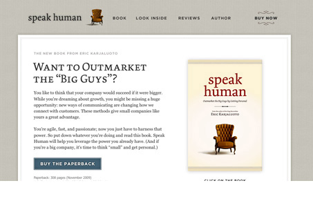
This site is really striking in it’s simplicity. The type treatment and hierarchy is perfect and the layout has a great balance. It’s very fine and sharp in it’s details and feels very ‘booky’ in that sense that you really want to dive in and flip through pages. I really like the way the links are a bold, red, sans-serif, mixed in with the copy set in Georgia. It’s as if it separates the printed (as in paper) from the web-only stuff (like links). It’s a subtle effect that works really well.
Looking Fast: The Art of Website Speed Perception
In the web world, technical speed and user perception matter. By improving design for a faster appearance, you boost conversions and stand out online. Speed isn’t just loading time; it’s perception.


Hi UMS!
Just wanted to thank you for mentioning Speak Human–very nice to read your positive feedback for it!
Cheers!
Eric
Beautiful website, excellent use of white space and the navigation is nice and clean.