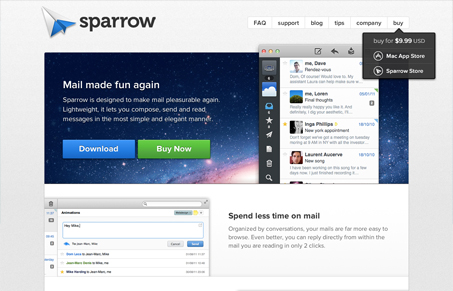
Super clean design with enough interactive details to keep it interesting. I like this site most because it takes that tried and true Apple style and mixes it with some uniqueness to come to a really nice cross design experience. The queue here is that the site design is clean and engaging so the app will be just a much – it’s a very tall order to full-fill but I feel like the sparrow site does just that. Great work!
Glassmorphism: The Transparent Design Trend That Refuses to Fade
Glassmorphism brings transparency, depth, and light back into modern UI. Learn how this “frosted glass” design trend enhances hierarchy, focus, and atmosphere, plus how to implement it in CSS responsibly.


Solid design. Nice interactions. I don’t like the lowercase global nav. Looks like a mistake.