
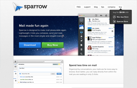
Super clean design with enough interactive details to keep it interesting. I like this site most because it takes that tried and true Apple style and mixes it with some uniqueness to come to a really nice cross design experience. The queue here is that the site design is clean and engaging so the app will be just a much – it’s a very tall order to full-fill but I feel like the sparrow site does just that. Great work!




Solid design. Nice interactions. I don’t like the lowercase global nav. Looks like a mistake.