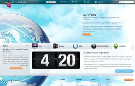
There’s a lot going on in this site both visually and code wise. Honestly i’m not sure how I truly feel about it…
On one hand it’s a well finished, nice looking design. On the other hand it’s very overwhelming visually and I don’t get a clear sense for what these guys are really all about without digging. What are your thoughts?


I would have to agree with you. Upon visiting the site, it probably took me a full minute to gather what these guys actually did. Even now I don’t know the full range of their abilities.
They really waste their primary real estate with the “Sourcebits” title and Carl Sagan quote in the middle of the page. It’s so vague and useless, it doesn’t actually *say* anything. Just marking jargon about being creative. But in _what_?
This website would benefit from a couple of things:
1. Replace the Sourcebits and Carl Sagan quote plus paragraph with something like a large “Mac & iPhone Application Developement” line, assuming that’s their bread n’ butter. The web, ui and Android stuff will follow, but the big attraction is probably the mac and iPhone stuff. Heck, even just the iPhone stuff these days.
2. Replace the completely generic globe. It means nothing, and is incredibly cliche. They have some great screenshots from their apps, they should likely display those laid over an iphone. Or a shot of an application on a Mac, and have it randomized.
Visually, it’s a well done site. But it prides design over communication far too much.
From the start I am overwhelmed with navigation choices in the viewport of the page, even though I’m using a smaller 17″ widescreen monitor. The top navigation, the scroller and the footer links are all in close proximity to each other and are highly designed, but lack a sense of connection.
The content is also very loose and haphazard on the left, on the right and then on the left again, all accompanied by bright orange buttons that quickly pull my attention back and forth across the page, giving the content a the same scattered feeling as the navigation.
There are a lot of great design and interface elements on the site, but I do not think that they all belong on the same website.
I really like the overall design of this site. Its bold and is quite “client friendly”. It definitely has a WOW factor. Also I like the way the planet scrolls through the window.
There are a few issue though – it needs something near the logo – just one line to explain what they do. I got most of the information from the title element.
Maybe its due to who they are aiming for but on a 1024 x 768 screen I get a massive horizontal “crawlbar”. Also at this resolution there is too much vertical scrolling for my tastes.
While it breaks the mold…and the fold (slaps knee) of most sites, the visuals are really nice. I also wanted to point out that the creators have already removed the Carl Sagan quote and changed the title header text to: “We develop application for Mac, iPhone, Android and Web.” Great move, guys.
And that simple change alone does wonders for letting people get into what they do quickly and easily…