Submitted by Aaron Irizarry, @aaroni268. Designer & Developer.
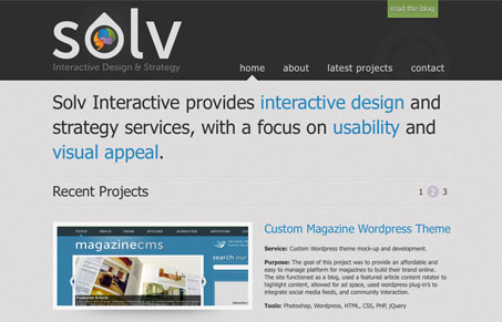
I like the big logo and oversized feeling nav elements and headline. The elements on this page are a bit larger than typical websites and it’s working to make it feel different I think. I also like the jagged angled elements used to separate the footer area.
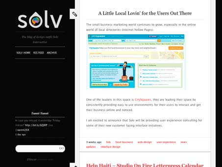
The blog is also quite nice, I like how it ties in with the main site but is just enough different to stand on it’s own. I like the static left side bar area treatment. This looks like an Obox Tumblr theme but it works so seamless with the main site it’s just perfect.


0 Comments