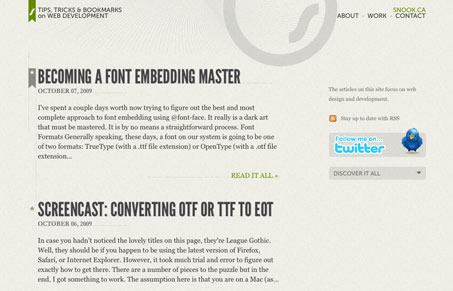
New update for the website of Jonathan Snook. I think I like this design much better than the previous site design. It’s simple and minimal and really focuses me on the posts of which he some great ones!
Glassmorphism: The Transparent Design Trend That Refuses to Fade
Glassmorphism brings transparency, depth, and light back into modern UI. Learn how this “frosted glass” design trend enhances hierarchy, focus, and atmosphere, plus how to implement it in CSS responsibly.


It could definitely benefit from a designer’s touch. I like the simplicity and useability but there are spacing issues between many elements. The thumbnails on the “Work” page are not layed out well and the striped footer seems drab and uninteresting.
I do enjoy the sketched portrait though.