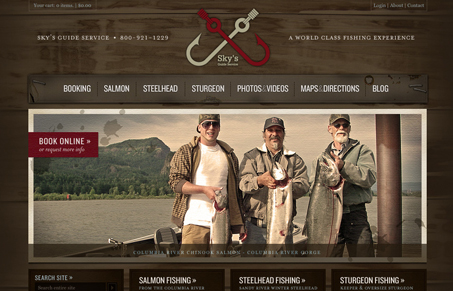
I love this site, from the wood background/texture to the way the photos have all been touched up. It can’t be easy to keep this site looking clean and tight like this either with the way the photos come in. I love the type and colors too. There’s so much detail in this design, from the logo down to the fish icons near the footer on the home page, it’s just a well designed website. Great work!
Looking Fast: The Art of Website Speed Perception
In the web world, technical speed and user perception matter. By improving design for a faster appearance, you boost conversions and stand out online. Speed isn’t just loading time; it’s perception.


I’m really digging all the minute details on this site. From the torn edge at the bottom to the staple at the top, all of these small elements combine to make a rich design with real depth.
One thing that I’m not digging so much is that a lot of the type is really small. Most text set in a serif is quite hard to read, and the form on the booking page is so small that I’m willing to bet that people just overlook that. I get that there’s a lot of content they’re squeezing on each page, and it’s laid out well, I’m just concerned that some people may be missing out or having a hard time taking in some of their content.
Yeah, that call to action in the “book online” graphic is a bit quiet visually. I think it’s the hue of that garnet color, it just mixes in so well with the rest of the color palette it’s not as prominent as it could be.
This site has a great feel. The photography is great. I like fishing and it makes me want to grab my tackle.
I don’t have a problem with the book online graphic. The flow of the site is such that its easy to get to. As you read down the page you bump into the book now options. I do agree that the text is set too small in many places. Its readable but you have to work just a little too hard.
The clip made me wonder why it was a 9. You really have to experience it to get it’s real beauty.