
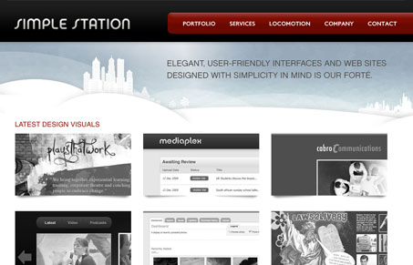
I really like the simplicity of this design, the big portfolio images on the homepage are nice and the b&w to color roll over effect is subtle. The blog is nice too not only in the way it looks and is presented but in the content too.


Fitts’s Law: Why the Easy Button Wins
Large, close targets are faster to hit than small, distant ones, that’s Fitts’s Law. A look at the 1954 rule behind buttons, prime and magic pixels, thumb zones, and dark patterns.


0 Comments