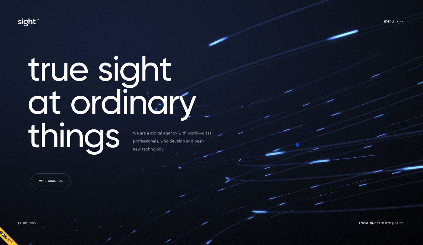
There’s a ton going on visually with this website. I’m not wild about the loading image and having to wait and/or click like that, but once you load it up you’re given a show. I love the background imagery/animation and how the mouse interacts with it. The scroll-timed sections are fun and work to draw you in.
Glassmorphism: The Transparent Design Trend That Refuses to Fade
Glassmorphism brings transparency, depth, and light back into modern UI. Learn how this “frosted glass” design trend enhances hierarchy, focus, and atmosphere, plus how to implement it in CSS responsibly.


0 Comments