Siete de Febrero

siete

Submitted by Sebastian Peña, Designer & Developer.

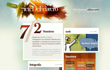
I really like the broken grid feel of this layout. The boxes are stacked what looks like hap-hazardly, but in a way come off balanced feeling. The brushed paint colors/textures behind the logotype are also a nice touch, the organic touch this design needed.

0 Comments

Submit a Comment

Your email address will not be published. Required fields are marked *

Time limit exceeded. Please complete the captcha once again.

News & Articles

Website Scanning Patterns for Maximum Engagement

Website Scanning Patterns for Maximum Engagement

Discover how users visually process websites, the role of scanning patterns, content placement, and “the fold” Learn to design engaging pages with fast-to-consume content that aligns with user behavior.