shopsanctuaryt.com

shopsanctuarytcom

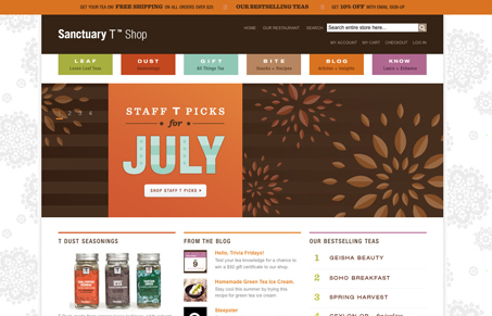
I like the simple color blocking going on here in the header, nav and some other areas of interest. The site is really clean all around in solid colors, content is well spaced and images are crisp and open. It means a lot that they have such quality photography and illustrations consistently through the products.

There are a few small areas that I think would help the users of this site a lot. The “Know” section has some interesting functionality but could be made more fun or simple to use. The subpage image areas also need some attention – I kept trying to zoom by dragging the bar but you can only use the plus or minus and when you click on the extra images they open in a new window which is unnecessary. Lastly, the remove icon in the shopping cart is small and hard to understand.

0 Comments

Submit a Comment

Your email address will not be published. Required fields are marked *

News & Articles

Looking Fast: The Art of Website Speed Perception

Looking Fast: The Art of Website Speed Perception

In the web world, technical speed and user perception matter. By improving design for a faster appearance, you boost conversions and stand out online. Speed isn’t just loading time; it’s perception.

Designing for Errors: Creating User-Friendly Contingency Plans

Designing for Errors: Creating User-Friendly Contingency Plans

Contingency Design hinges on empathy, understanding user frustration, and transforming errors into positive impressions. By embracing these principles, you enhance user experiences, retain customers, and boost revenue in the competitive digital landscap