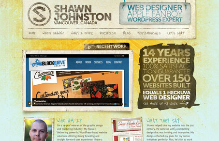
This is the second version of Shawn Johnston’s site we’ve reviewed here for the gallery, first version here. Julia and I did a screen cast review of this version. We both quite like the design. The textures are so nice and we both loved the typography. We discussed the headline copy a little, feeling that the vibe of it isn’t necessarily targeted correctly. Give a listen and see what you think.


0 Comments