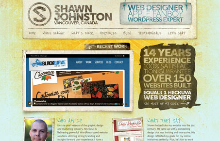
This is the second version of Shawn Johnston’s site we’ve reviewed here for the gallery, first version here. Julia and I did a screen cast review of this version. We both quite like the design. The textures are so nice and we both loved the typography. We discussed the headline copy a little, feeling that the vibe of it isn’t necessarily targeted correctly. Give a listen and see what you think.
Glassmorphism: The Transparent Design Trend That Refuses to Fade
Glassmorphism brings transparency, depth, and light back into modern UI. Learn how this “frosted glass” design trend enhances hierarchy, focus, and atmosphere, plus how to implement it in CSS responsibly.


0 Comments