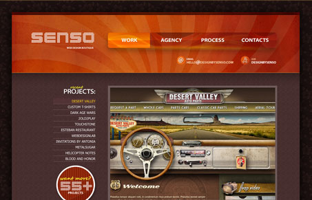
This is a great example of laying a somewhat visually complex design on top of a relatively simple framework. There’s quite a bit of textures overlaying the color areas and the main 3 navigation items while simple in naming and ‘button’ style lend a certain complexity in how they work with the background. There a few little things, like the fact that you can’t click on any of the displayed email addresses and get an email box to load like you would expect but overall they are minor disturbances that don’t greatly effect the site as a whole.
Glassmorphism: The Transparent Design Trend That Refuses to Fade
Glassmorphism brings transparency, depth, and light back into modern UI. Learn how this “frosted glass” design trend enhances hierarchy, focus, and atmosphere, plus how to implement it in CSS responsibly.


0 Comments