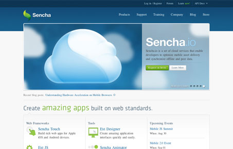
I love the simplicity and cleanliness of the sencha.com website. It walks that line between corporate and not quite well. The thing is there’s a ton of info on this site, just getting around all of Sencha’s various product information could have been a daunting task but the designers of this site make it easy. I love the icons and how they’re also in the drop down. In fact there are some really nice interaction across this site but they don’t hit you over the head – that’s good design.
It’s got to be hard creating a site that lives up to the same standards as the product. Like in this case Sencha Touch, etc… are superior products and the website has to deliver on that BEFORE you ever get into dealing with the product. Not an easy task but they’ve done it. Great work on this site!


0 Comments