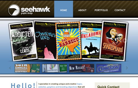
Good looking design, with some graceful gradations and sizing of details. A very thorough portfolio, maybe too thorough, I’d like to see more curation of the work. I also feel like the home page has too much on it, it goes from a nice simple view of work to a long page full of too much content. Don’t get me wrong it’s designed well and all the pages of this website are given attention like all good websites have.
Glassmorphism: The Transparent Design Trend That Refuses to Fade
Glassmorphism brings transparency, depth, and light back into modern UI. Learn how this “frosted glass” design trend enhances hierarchy, focus, and atmosphere, plus how to implement it in CSS responsibly.


0 Comments