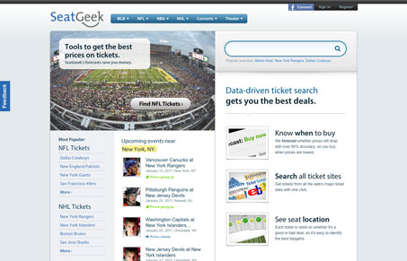
Super clean design with just the right amount of subtle interaction to help you instead of impress you. For example check out the “more” drop down on the main navigation. I love the strong two column layout too, it keeps the page flowing nicely. All the sections have just the right amount of spacing to let the content breathe.


0 Comments