by Gene Crawford | May 5, 2025 | Design Firm, Gallery, Screencast Review
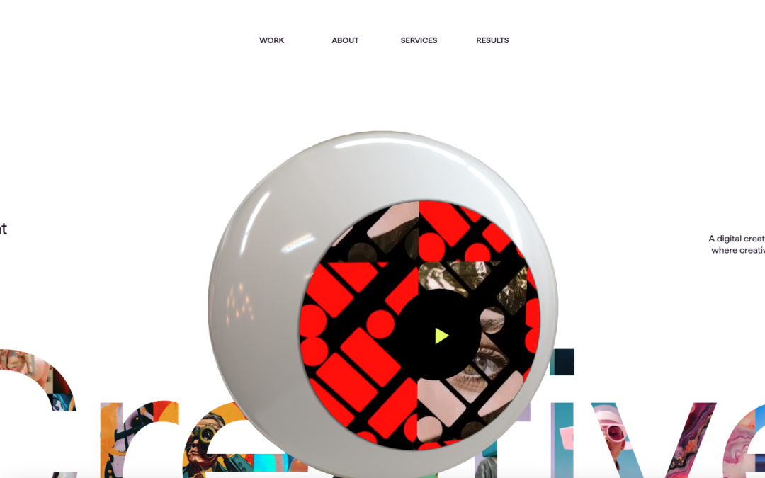
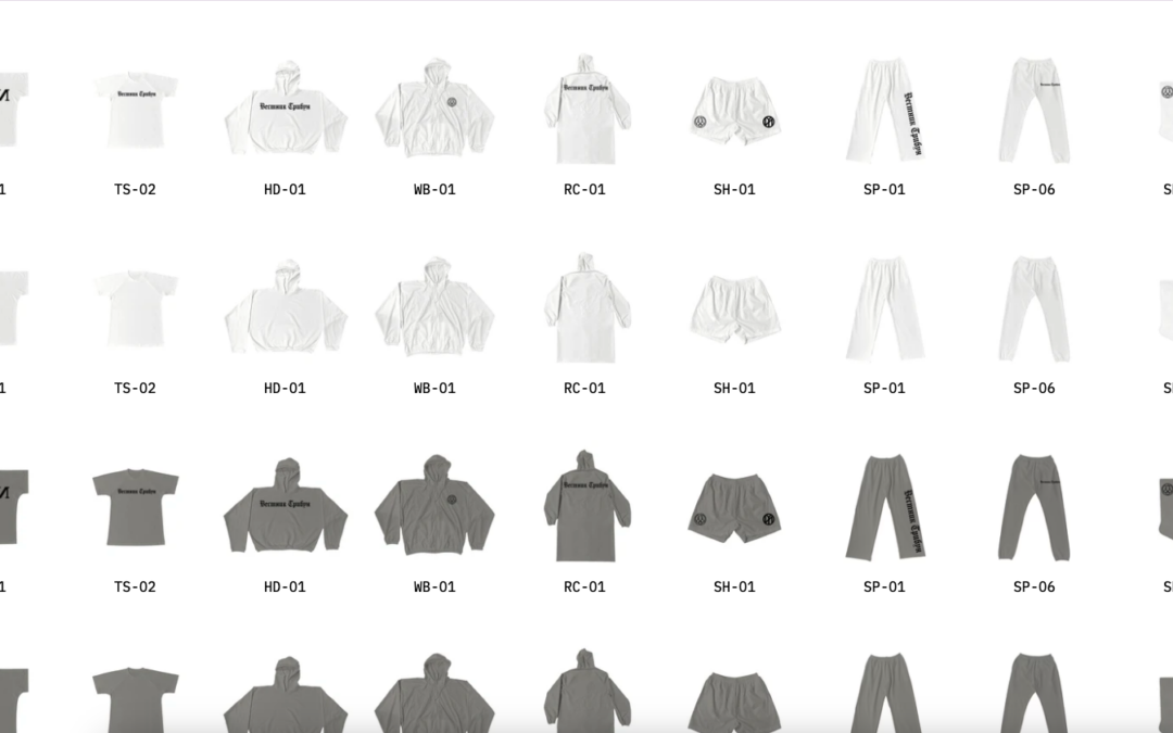
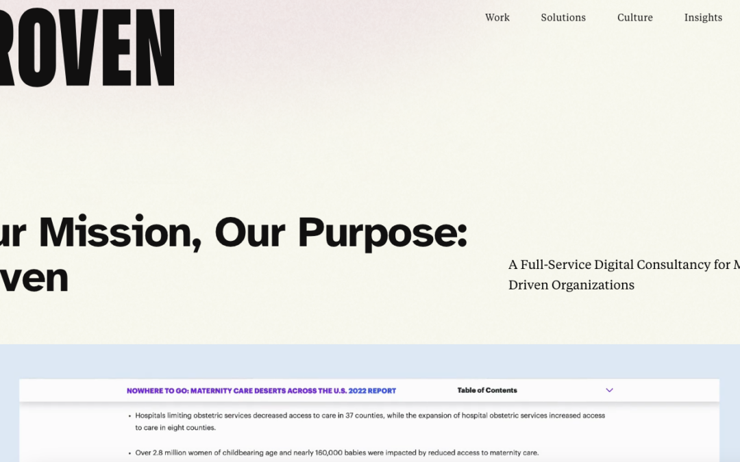
What a fun, well executed website. I say “executed” because it takes a high level of design skill and experience to pull off something that appears simply but yet has depth like this website does. Bravo Team!

by Gene Crawford | Apr 3, 2025 | Gallery, Screencast Review
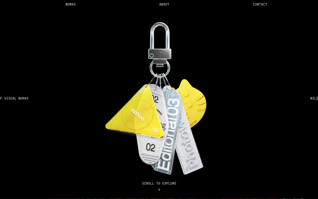
Winner of the Best Visual Design Framer award: “Great design seamlessly blends color, typography, and layout. Wildy Riftian impressed us with bold creativity and refined beauty. This highly interactive layout combines elegant design with innovative navigation...

by Gene Crawford | Mar 7, 2025 | Design Firm, Gallery, Screencast Review
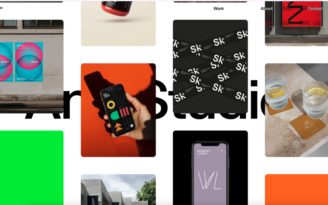
A brand design firm founded by Angelica Barco with 25 years of experience, widely recognized for its commitment to projects that matter and impact, moving towards a better future.

by Gene Crawford | Mar 4, 2025 | Gallery, Screencast Review, Travel
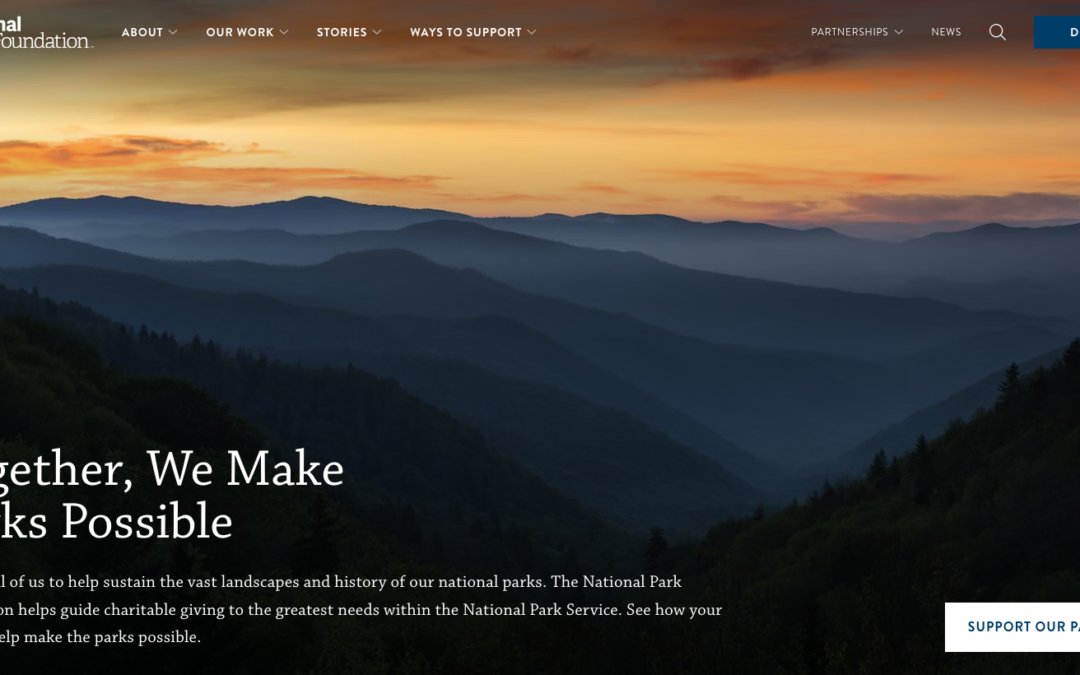
Beautiful website design. Straightforward layout but with some depth. Slight interactions here and there draw you in and I LOVE the navigation design.

by Gene Crawford | Mar 3, 2025 | Gallery, Screencast Review, Shopping
What even is this… I mean, I love minimalism. Maybe i’m wrong. What should I think?

by Gene Crawford | Feb 27, 2025 | Design Firm, Gallery, Screencast Review
The best part of this website design is the 2nd and 3rd part of the page as you scroll down. Some really solid interaction and information design there.
