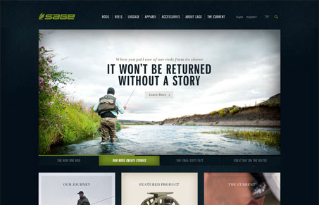
I don’t know the first thing about fly-fishing, but this site makes me want to learn more. The imagery is awesome and gives the site a documentary feel. There’s tons of info about the rods, reels, etc but the presentation of the content makes it underwhelming yet easy to navigate. The products are featured nicely in the design, and even the ecommerce areas don’t have a cluttered feel. I have to admit, the dropdown for the rods and reels in the top nav got a little annoying as I looked around the site. On one hand, it was neat that I saw that section when I hovered over the link because otherwise I may not have known it was there, but I think I’d much prefer to have to click to expose the area. Also, it was a little cumbersome to get to the comparison chart for the products. I kept looking for an obvious button to click after I chose the items to compare. All in all this is a great looking site. Great use of texture, shadow, and color. There’s definitely a strong brand presence and plenty of opportunity to get immersed in the world of fly-fishing beyond just the products they sell.

Looking Fast: The Art of Website Speed Perception
In the web world, technical speed and user perception matter. By improving design for a faster appearance, you boost conversions and stand out online. Speed isn’t just loading time; it’s perception.


The colors and texture and type all work together perfectly on this site. It’s really beautiful. I totally agree about the navigation, though. It’s really well designed and works well, it’s just that it has a tendency to pop down when you least expect it. Perhaps a little longer pause before it drops down would help. I’m also torn about whether it should push the page down or not. I’m not sure I’m a big fan of the scrollbar jumping around based on something you hover.