Ryan Keiser

ryankeisernet

Submitted by Ryan Keiser @ryankeiser,

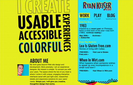
Personal site and playground of designer Ryan Keiser.

This site uses loud colors, but it uses them very well and in an interesting way. Also there is a sort of miss-aligned retro 3-D sort of treatment to some of the main logo-type elements. He seems to be really into color and it shows in his site and writing. That’s what this is all about, giving visitors a window into what you are all about…

I like the color inspiration sample in the footer area. Another thing I really like on this site is the header area of the blog, how it changes from the rest of the site but just slightly and enough to let you know where you are.

0 Comments

Submit a Comment

Your email address will not be published. Required fields are marked *

News & Articles

Looking Fast: The Art of Website Speed Perception

Looking Fast: The Art of Website Speed Perception

In the web world, technical speed and user perception matter. By improving design for a faster appearance, you boost conversions and stand out online. Speed isn’t just loading time; it’s perception.

Designing for Errors: Creating User-Friendly Contingency Plans

Designing for Errors: Creating User-Friendly Contingency Plans

Contingency Design hinges on empathy, understanding user frustration, and transforming errors into positive impressions. By embracing these principles, you enhance user experiences, retain customers, and boost revenue in the competitive digital landscap