rxbalance.com

rxbalancecom

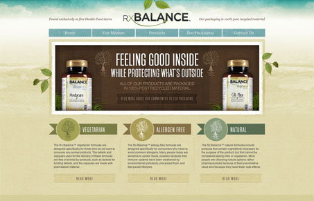
I really dig the RxBalance website. I like the background image/colors used, the watercolor(ish) style is nice. The overall layout is well balanced with copy and imagery. This is probably a super tiny detail but I love how the social media icons look like they are just hovering over the design, it makes them stand out so clearly even though they are down in the footer. Nice work on this site!

0 Comments

Submit a Comment

Your email address will not be published. Required fields are marked *

News & Articles

Looking Fast: The Art of Website Speed Perception

Looking Fast: The Art of Website Speed Perception

In the web world, technical speed and user perception matter. By improving design for a faster appearance, you boost conversions and stand out online. Speed isn’t just loading time; it’s perception.

Designing for Errors: Creating User-Friendly Contingency Plans

Designing for Errors: Creating User-Friendly Contingency Plans

Contingency Design hinges on empathy, understanding user frustration, and transforming errors into positive impressions. By embracing these principles, you enhance user experiences, retain customers, and boost revenue in the competitive digital landscap