
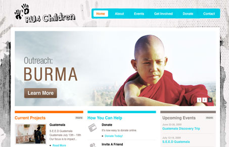
Nicely designed website, I really like how all the typography plays together. There’s a couple of different styles working together on this design and they contrast well and mix up to make a rather intriguing design. The photography is really strong too, really puts me in the middle of the “story” and gives me context for who i’d be helping by donating. My favorite section is the footer area, it’s just a really well balanced hub (visually and content wise) for interacting with the organization online.


Fitts’s Law: Why the Easy Button Wins
Large, close targets are faster to hit than small, distant ones, that’s Fitts’s Law. A look at the 1954 rule behind buttons, prime and magic pixels, thumb zones, and dark patterns.


0 Comments