rothco.ie

rothcoie

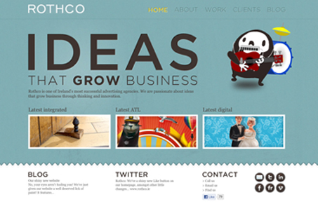
I love the colors, the green(ish) with the slight texture and the black with tiny bit of white and orange. Just the right mixes. I like the illustration/character used on the home and and throughout, it’s fun. The neat thing is on the portfolio pages, when you click on a sample it turns into a single page design with a fixed header and footer. That’s kind of a cool ‘effect’, I call it that because the whole site isn’t setup like that and you sort of discover it when you hit the portfolio. It was a nice little surprise to me.

0 Comments

Submit a Comment

Your email address will not be published. Required fields are marked *

News & Articles

Looking Fast: The Art of Website Speed Perception

Looking Fast: The Art of Website Speed Perception

In the web world, technical speed and user perception matter. By improving design for a faster appearance, you boost conversions and stand out online. Speed isn’t just loading time; it’s perception.

Designing for Errors: Creating User-Friendly Contingency Plans

Designing for Errors: Creating User-Friendly Contingency Plans

Contingency Design hinges on empathy, understanding user frustration, and transforming errors into positive impressions. By embracing these principles, you enhance user experiences, retain customers, and boost revenue in the competitive digital landscap