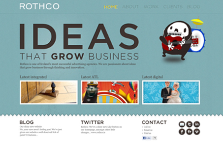
I love the colors, the green(ish) with the slight texture and the black with tiny bit of white and orange. Just the right mixes. I like the illustration/character used on the home and and throughout, it’s fun. The neat thing is on the portfolio pages, when you click on a sample it turns into a single page design with a fixed header and footer. That’s kind of a cool ‘effect’, I call it that because the whole site isn’t setup like that and you sort of discover it when you hit the portfolio. It was a nice little surprise to me.
Glassmorphism: The Transparent Design Trend That Refuses to Fade
Glassmorphism brings transparency, depth, and light back into modern UI. Learn how this “frosted glass” design trend enhances hierarchy, focus, and atmosphere, plus how to implement it in CSS responsibly.


0 Comments