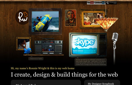
I think this is an update to the home page of ronniewright.co.uk, at any rate it’s pretty good. I like the collage style of putting elements around the page like he’s done, it makes it really interesting. I do think most people will expect the elements to do things, like be more interactive or animated or something, I know I did and was a little let down that they didn’t. But that’s probably a good thing, meaning I wanted more, so keep going man.
Glassmorphism: The Transparent Design Trend That Refuses to Fade
Glassmorphism brings transparency, depth, and light back into modern UI. Learn how this “frosted glass” design trend enhances hierarchy, focus, and atmosphere, plus how to implement it in CSS responsibly.


Thanks for showcasing my website again, the homepage is an addition to the scrapbook that you featured a while back. I know what you mean about expecting some more animation (movement) – that’s to come once I’ve launched my new project ‘TT’. However I am putting together a ‘screening room’ to add to my website and should have it up in a couple of weeks, which should add a little more dimension to the site.
Thanks again for showcasing my website!