Renovo

http://www.renovobeauty.com/

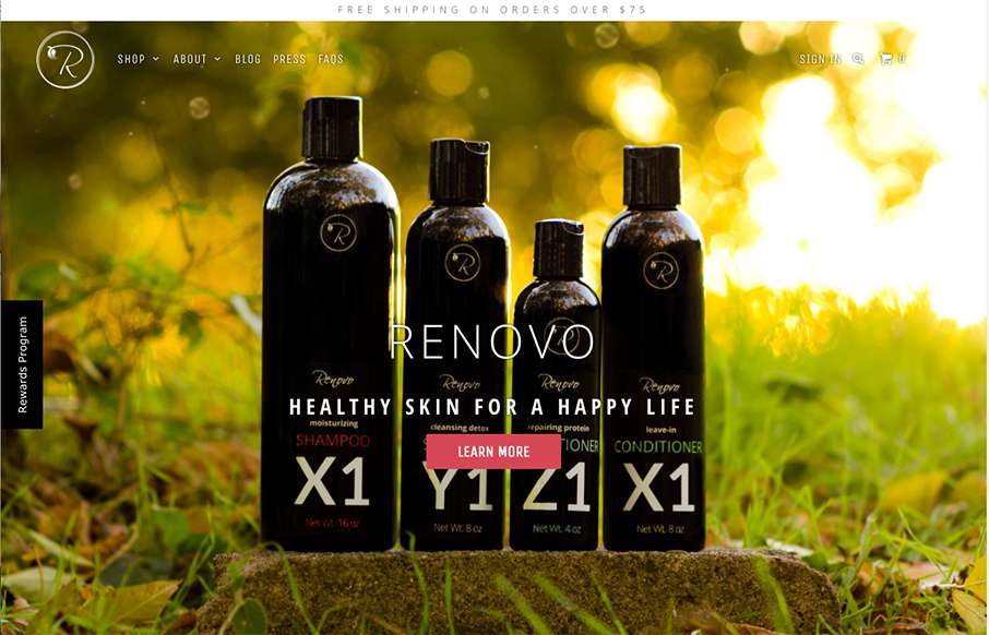
Some great photography set fixed in the background like this can go a long way for engagement. I also dig the first run animated fade in images down the page. Pretty strong layout.

From the Designer:

This beautiful site came to be after months of trial and error. We wanted a website that felt as natural and organic as our beauty products. This parallax-style design is open and airy with a fluid feeling that lends itself well to our brand. The product and lifestyle photography brings it all together.

Twitter: @RenovoBeauty
Role: Director of Marketing
Country: United States

0 Comments

Submit a Comment

Your email address will not be published. Required fields are marked *

News & Articles

Sign-Up: Enhancing Conversions through good UX

Sign-Up: Enhancing Conversions through good UX

Optimize your website’s sign-up process by focusing on clarity, ease, and user mindset. Clearly explain the purpose, benefits, and steps, and use social proof to build trust and drive conversions.

The Essential Guide to Getting Started on Freelance Writing

The Essential Guide to Getting Started on Freelance Writing

Explore the lucrative and fulfilling world of freelance writing with our essential guide. Learn about specialties like blogging, social media, article, and technical writing. Build a portfolio, find work, set up your business, and discover the potential earnings. Embrace the freedom of working from home and follow tips for success in your dream career.