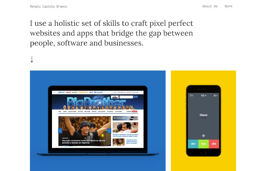
Great minimal portfolio site for Renato Castelo Branco. I really like the simple grid layout and bold coloring to help you follow along super quick and focus on the imagery. Clean, clear and concise design always wins.


The Call to Action, Revisited
The Call to Action hasn’t changed in a decade, but the bar has. A fresh look at prominence, copy, mobile tap targets, and accessibility, with lessons from three major design systems.


The intro text makes we want to throw up. “I use a holistic set of skills to craft pixel perfect (like that exists nowadays) websites”. FFS, it manes nothing, and imagine a potential client reading that. Designers really need to climb out of their own arses and stop trying to impress their peers. OK Rant over 😉
Hey MrMulder – you won dude – looks like he changed it.