Very open and yet stiff feeling design. I like the white space and how it’s utilized in this design and at the same time I like the simplified grid layout too. Bold move just having the links be the pictures of the work, I imagine that works really well too.
There’s some super cool product concepts here too, like the nightlight bookmark, I’d love one of those!


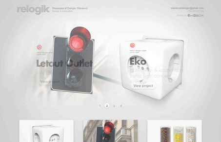
This site, while not the best design, utilized an open layout to highlight the great products. There were some nice touches too, like the opacity change on rollover, and the nice use of photography.
I loved the tea infuser.