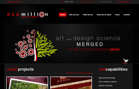
Fairly straight-forward design firm website, however the red, stark white and majorly dark “black” background makes it feel visually loud. I’m not saying that’s a bad thing, take it or leave it. I like a lot of pieces of this design, the portfolio section layout is really simple and clean and it’s packed with cross-sectional way to view the work. Though, I’m never a big fan of justified paragraphs and this design is no exception. Overall good work here, take a look at the portfolio organization and see what you think.
Glassmorphism: The Transparent Design Trend That Refuses to Fade
Glassmorphism brings transparency, depth, and light back into modern UI. Learn how this “frosted glass” design trend enhances hierarchy, focus, and atmosphere, plus how to implement it in CSS responsibly.


0 Comments