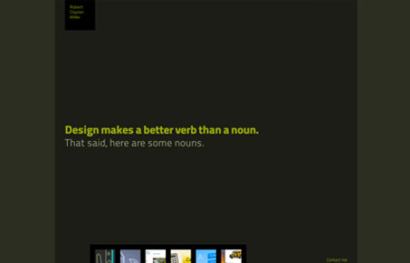
Really cool navigation design here. I like that the site is decidedly a portfolio. Using small thumbnail dribbble like shots to denote the page in the navigation works really well here. I also love how the thumbnails stay in place in the header or footer area depending on where you are within the site. Smartly done.
Glassmorphism: The Transparent Design Trend That Refuses to Fade
Glassmorphism brings transparency, depth, and light back into modern UI. Learn how this “frosted glass” design trend enhances hierarchy, focus, and atmosphere, plus how to implement it in CSS responsibly.


0 Comments