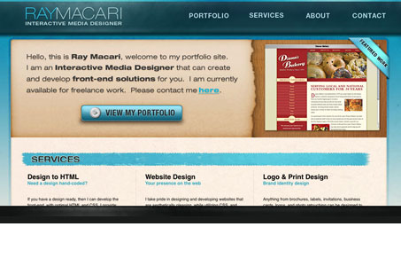
I really like the look & feel of this design. I just feel like they’ve taken the javascript too far on it. The scrolling and action in the header is a bit distracting to me and it also seems to break the “back” convention in my browser. The lightbox effect on the portfolio samples also doesn’t do much for me here. However, I don’t think these things “break” the site or keep it out of the UMS gallery, since I think it really does look great indeed.
Glassmorphism: The Transparent Design Trend That Refuses to Fade
Glassmorphism brings transparency, depth, and light back into modern UI. Learn how this “frosted glass” design trend enhances hierarchy, focus, and atmosphere, plus how to implement it in CSS responsibly.


0 Comments